My Role
Solo designer: Design, discovery and ideation, competitive analysis, interaction design and prototyping
Team
- Product Managers
- Product Owners
- Developers
- Quality Assurance (QA)
- Scrummasters
- UI/UX Researchers
Platform/Tools
- Web- Desktop
- Mobile
- Figma
- Miro
designed in figma!
The problem at hand
This team's initiative was to create a digital experience for Truist banking customers.
Examples:
- - Building out flows like paying off a credit card
- - Transferring money to an account
- - High-level information displays: dashboards
I was tasked with finding a better way to surface the PDF walk-throughs hidden in the current help screen. This was to be solved by creating a wizard help solution for displaying information throughout the site.
Organizing my thoughts
- - Learned new design tools Miro and Adobe XD, agile methodology, and how design is incorporated
- - Shadowed user testing for new designs
- - Meet & greets with team members for UX & UI design, content strategy
- - Shadowed scrum team ceremonies including PI Planning, mid-sprint demo & end of sprint demo, story grooming, feature grooming, design review & design system updates
Figuring out the flow
Began taking the design step-by-step through the process listed below:
DOCUMENTING USER FLOWS to understand the functionality behind the "FAQ/self-help window" and give me the chance to organize the information in a more visual way.
Done in Miro! -->
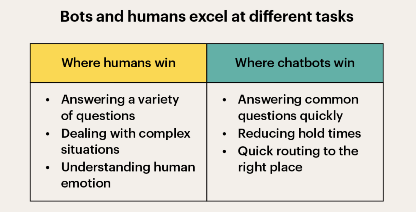
I also CONDUCTED RESEARCH on customer reactions to chatbots and conflicting views on using them exclusively for 'immediate help'.
Click here for a more detailed explanation of my research!
Applying my thoughts and ideas
As you can tell, there are different pros and cons to keeping a chatbot, and through my research I realized that customers should be given a blended approach.
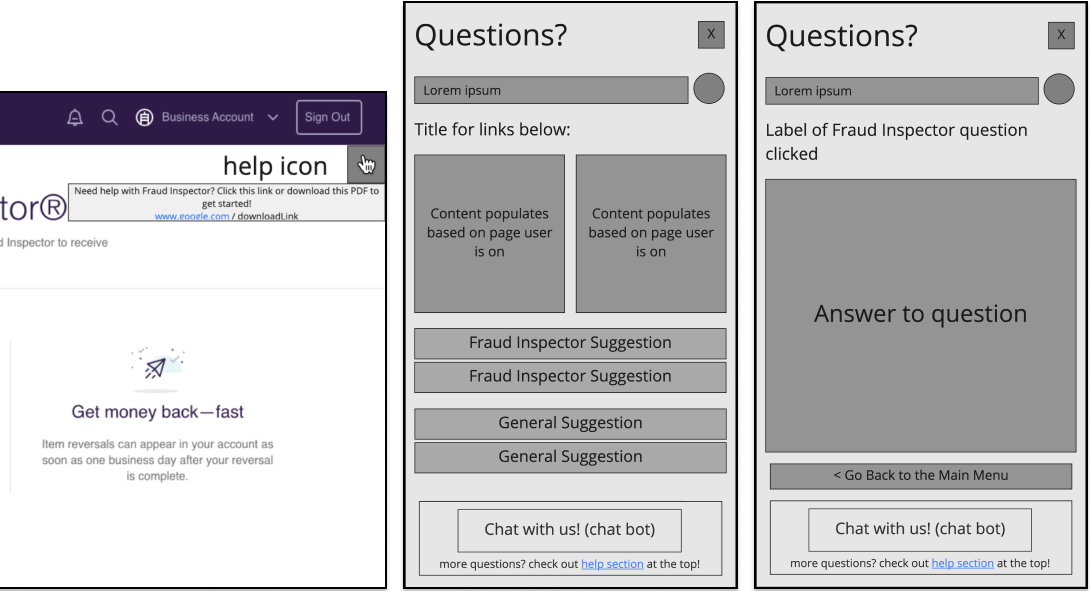
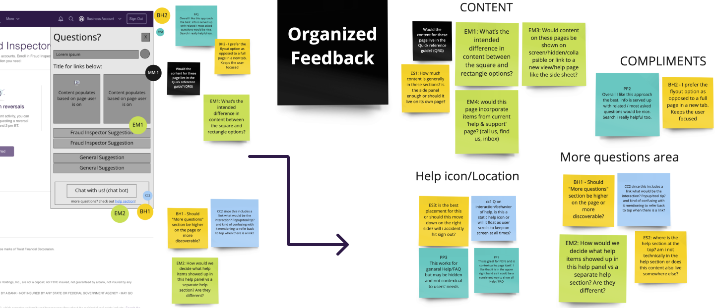
I crafted LOW-FIDELITY WIREFRAMES incorporating the above information, presenting them for feedback during a 'Design Critique' session. This proved invaluable for receiving input from skilled designers and was a highlight of my internship.
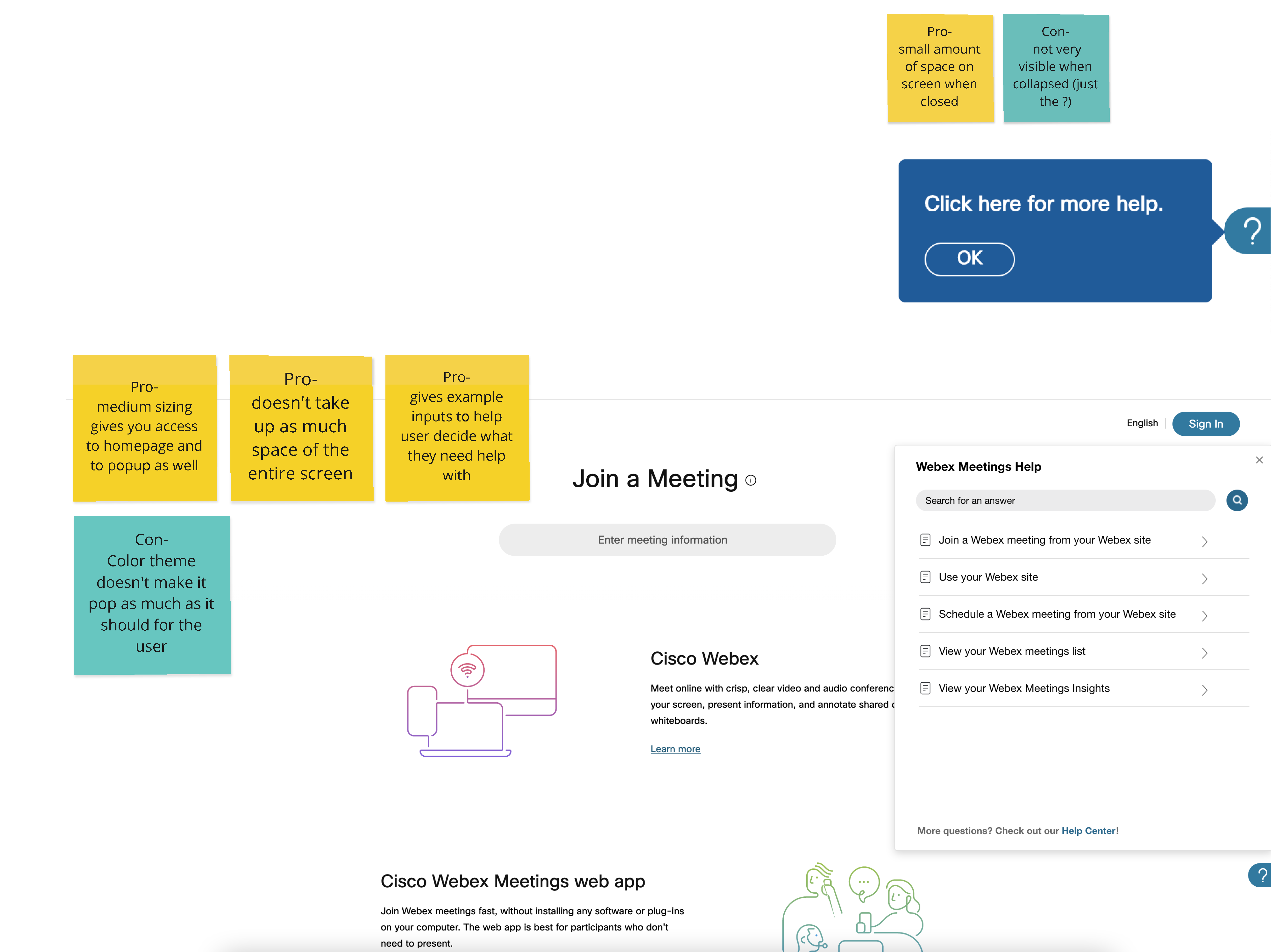
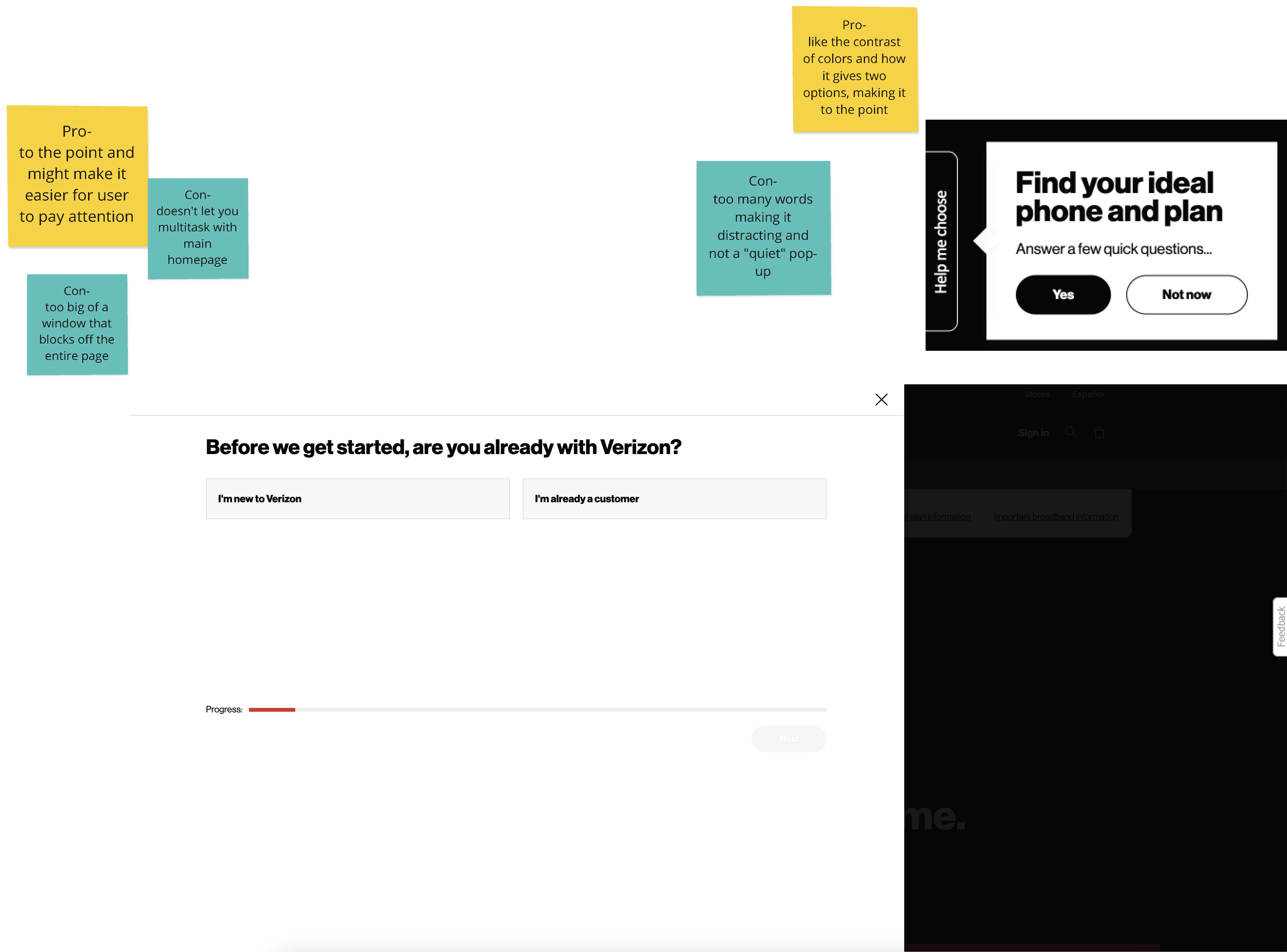
Snapshot of how I organized the feedback received in Miro with the help of my team!
Design Process
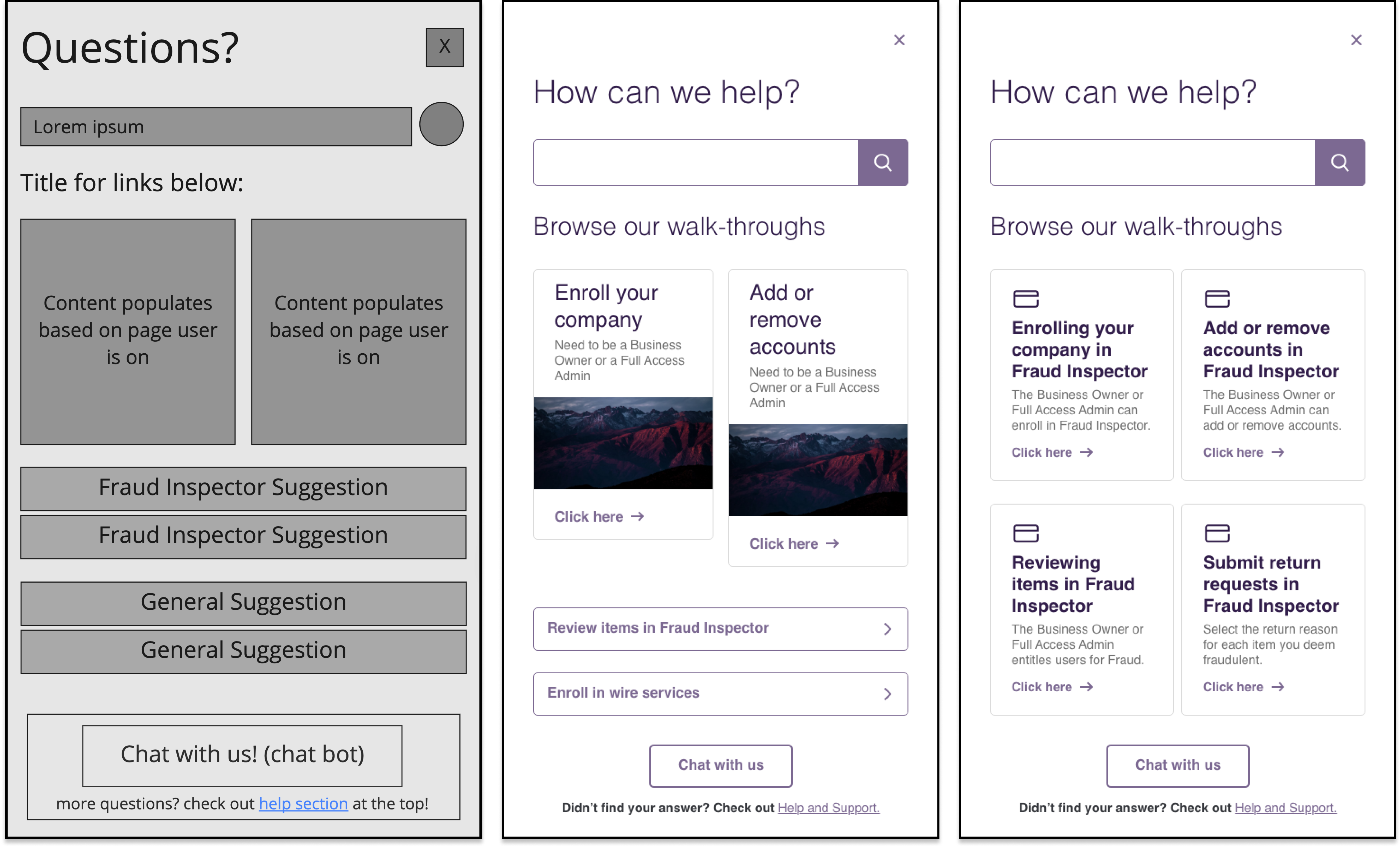
This is the design process I took for the "main menu" screen from the low-fidelity wireframe to the final UI spec.
Final Designs (for now!)
Taking the feedback from design critique, I created final designs and then presented them, while demonstrating and speaking to the steps that led to the proposed solution.
©2024 by Ramya Ramaswamy.

